
OBJECTIVE
Create an emotional VR experience through which young audiences can understand the impact of the Holocaust.
CLIENT
This project is in conjunction with Matt Toner of Zeros2Heroes studios, and partner Michael Liebe of Booster Space, Berlin.
ROLE
- UX Design
- 3D VR Space Design
- Environmental design on Unity
- Physical space Design
PROBLEM
“Thirty-one percent of Americans, and 41 percent of millennials, believe that two million or fewer Jews were killed in the Holocaust; the actual number is around six million. Forty-one percent of Americans, and 66 percent of millennials, cannot say what Auschwitz was. And 52 percent of Americans wrongly think Hitler came to power through force.” (Astor, 2018).
OPPORTUNITY
The client had a vision of a high-fidelity, vertical slice of a larger VR concept project, focused on teaching the impact of WWII’s Holocaust to North American teenagers. The goal is for the users to learn through experience and emotions. The project includes branding and a promotional video as well.
SWOT ANALYSIS
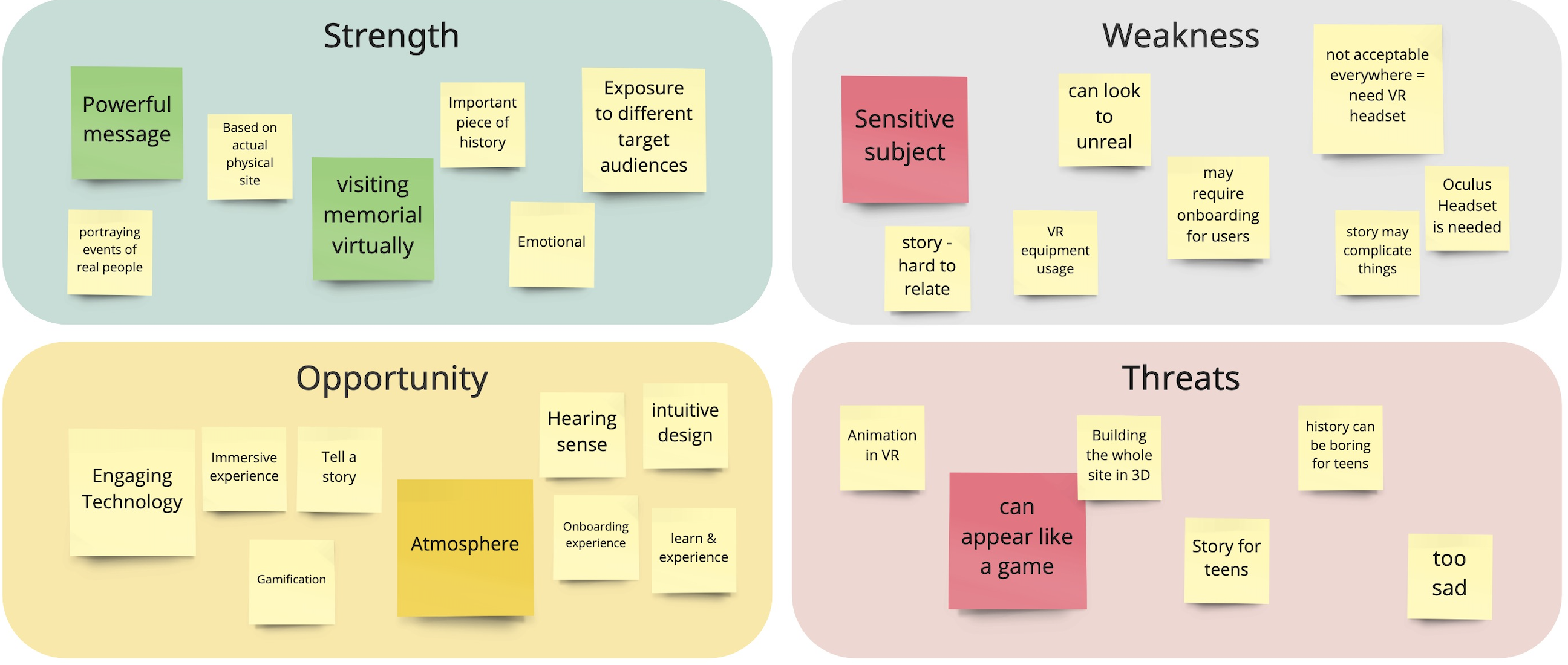
The first goal was to determine our long term goal for the project as well as the definition of the agile statement. These two will help to stay focused on the core value that we will be trying to bring to our users. We did a brainstorming session and a SWOT (Strength, Weakness, Opportunity & Threats) analysis.
Main key points
- This will be a great opportunity for teens to visit the memorial without travelling.
- The technology makes it engaging and interesting.
- This is a sensitive subject that will need to be handled carefully.
AGILE STATEMENT
FOR North American Teens
WHO are tech-savvy learners
THE ABSTRAKT Memorial Experience is a portable VR experience
THAT uses technology and emotion to teach valuable lessons regarding the Holocaust.
UNLIKE traditional museums
OUR PRODUCT fully immerses the user in the experience while using cutting-edge technology to teach and inform.
USER RESEARCH
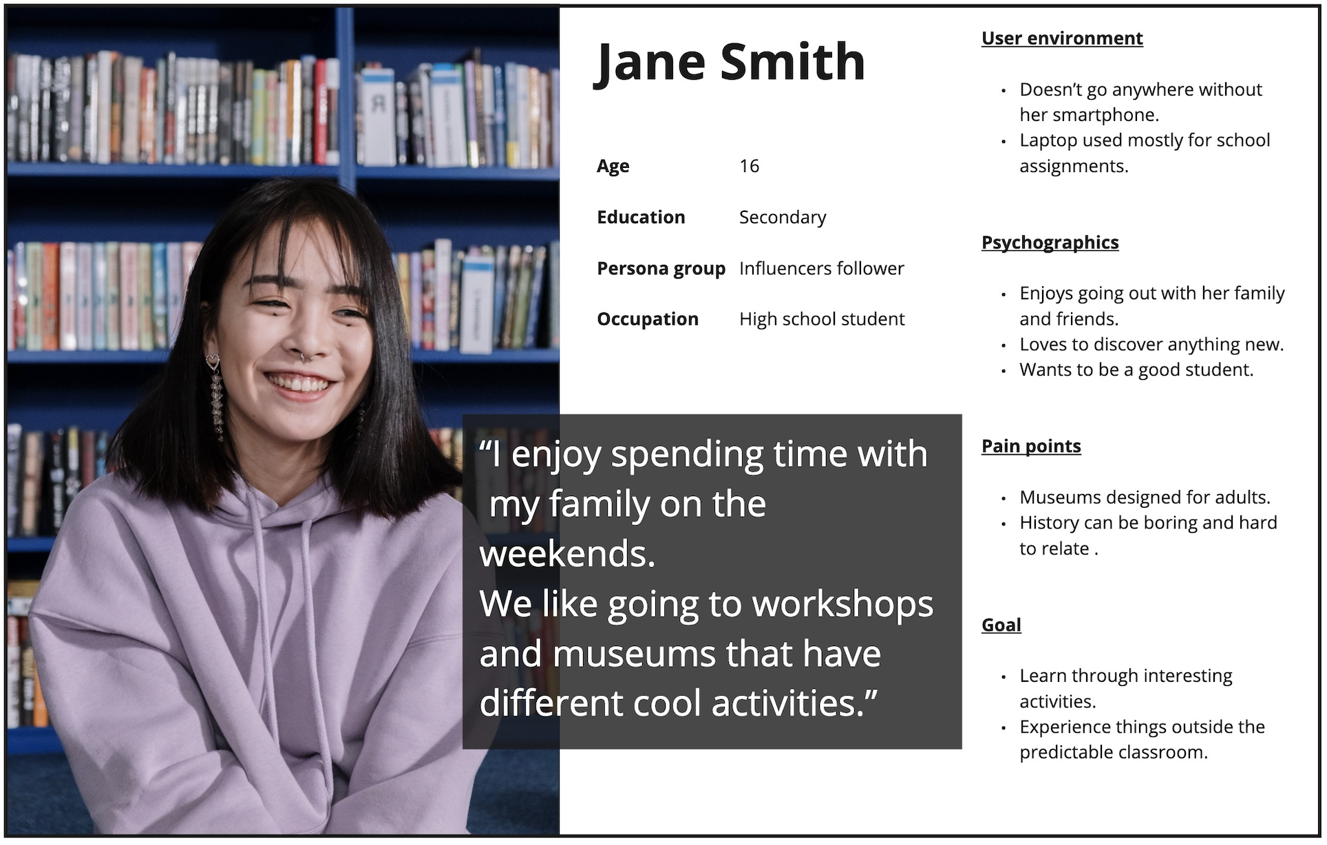
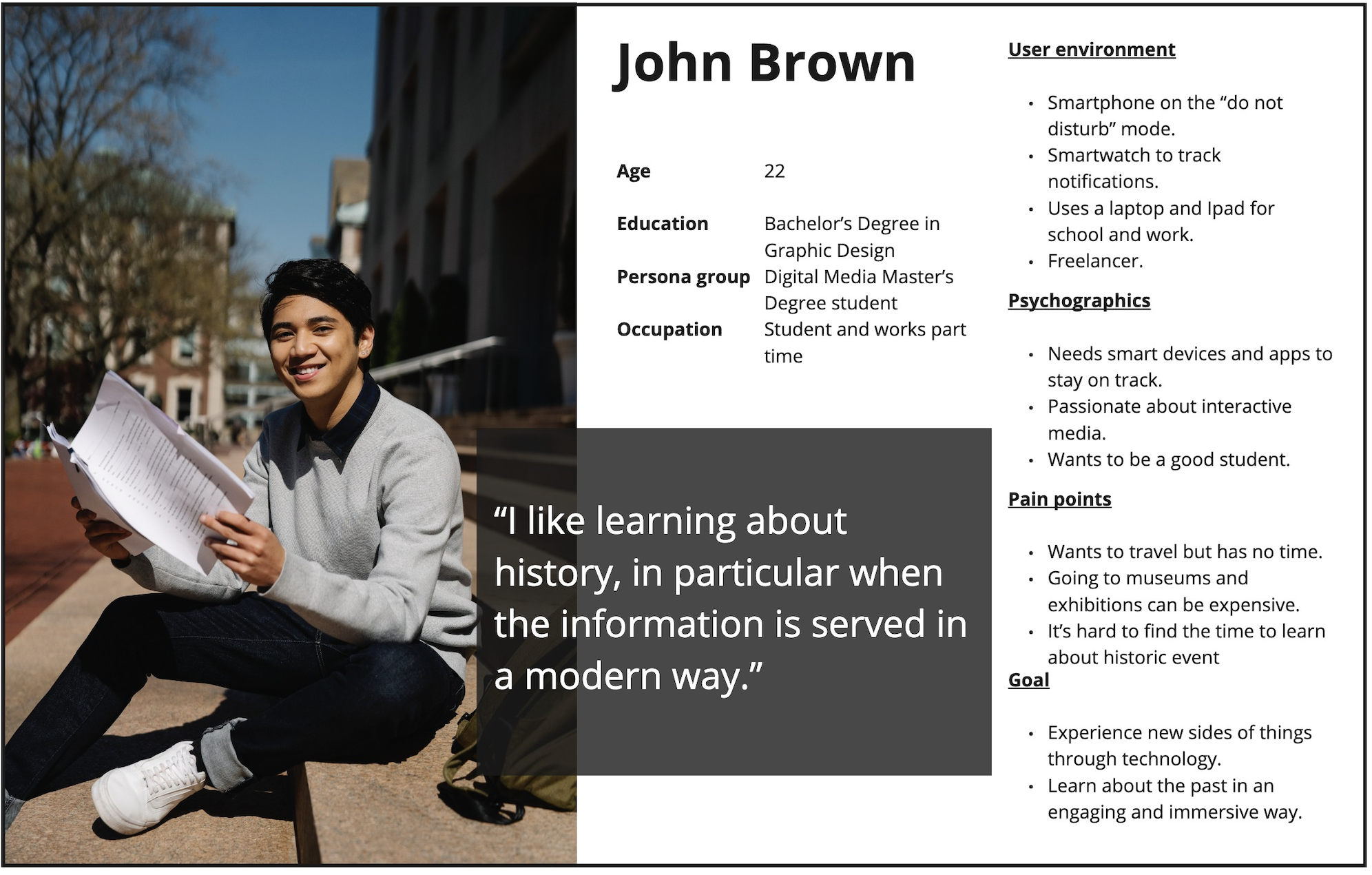
This project targets young adults (ages 14-25), and since I couldn’t conduct user interviews with teens without their parents consent (and there were no time to actually pull it off) I decided that I will base my user personas on two researches.
- User interviews – interviews with young adults ages 18 and up.
- Museums – research on how museums adjust exhibitions to attract young audiences, ages 14-18.
Key findings
- Immersive, tech savvy exhibitions impress a younger audiences.
- Environment and activities which allow interaction.
- Young people like the freedom to learn for themselves, in their own way and in their own pace.
USER TEST – A/B TESTING
The first user test was to determine whether the experience should be abstract or a depiction of a real story. Fortunately there was a whole cohort as well as faculty members to get insights from.
Two versions of the experience were presented
- Bandersnatch approach – The user enters a story as one of the people in the wagon and interacts with a family. He will need to make some choices along the way that may affect different outcomes. Here the user is an active member in the story.
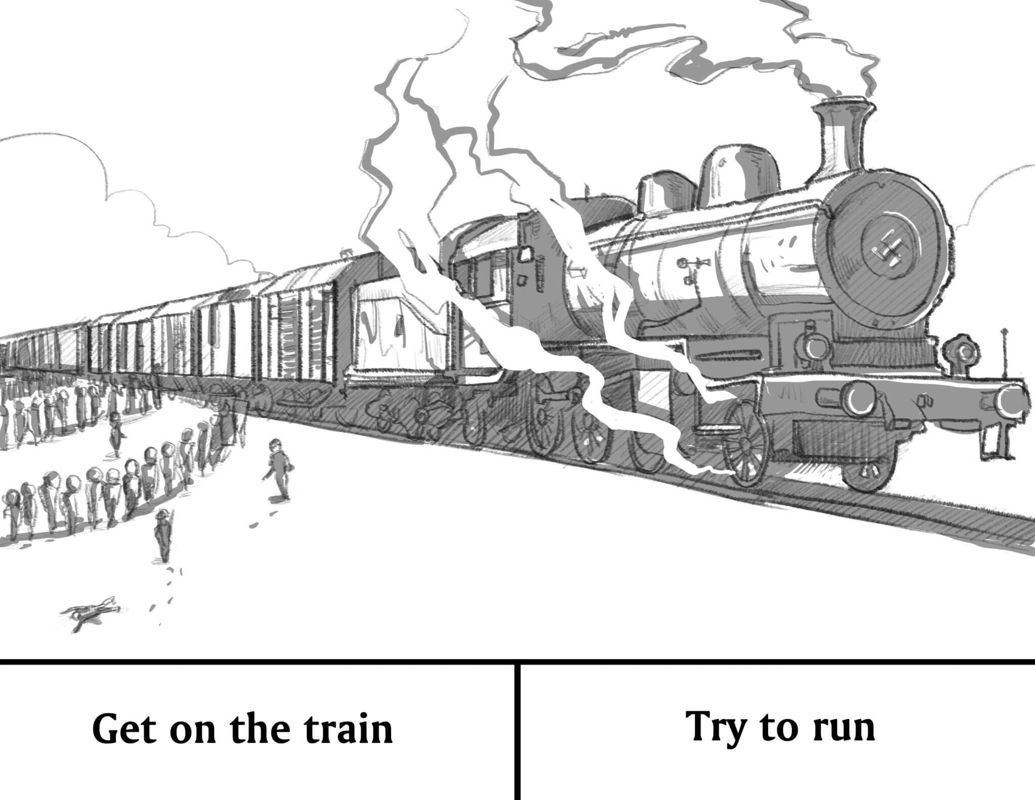
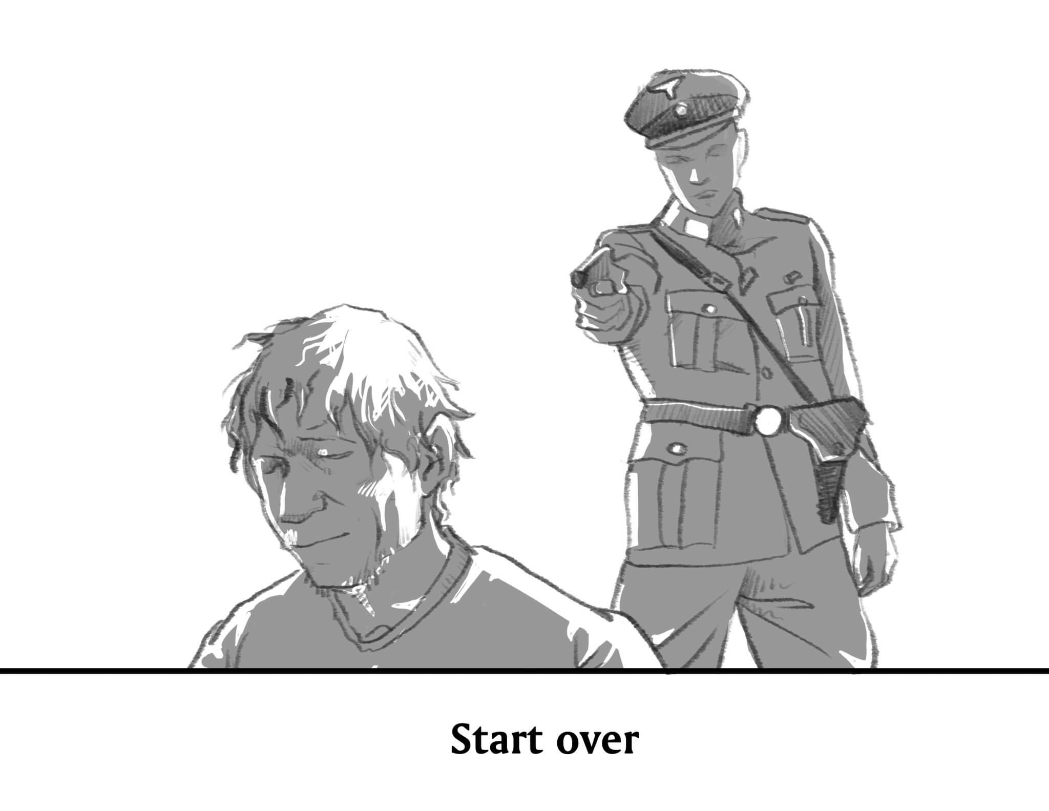
- Abstracted approach– The user enters an abstract and unknown scene that will evoke emotions, after this the scene from a real event (a train wagon) will be revealed. The goal is to make the user first feel, then see and finally digest the information. Here the user is a passive member in the story.
Results
Active preferable because there is more interaction.
There should not be any ability to change the storyline as all had already happened.
There is a great opportunity to evoke emotion with sound.
SITE RESEARCH
The Holocaust Memorial in Berlin was the starting point for the whole idea. With my background as an architect I felt excited to research as much as I could about the space, feeling within it and the background behind architectural design choices.
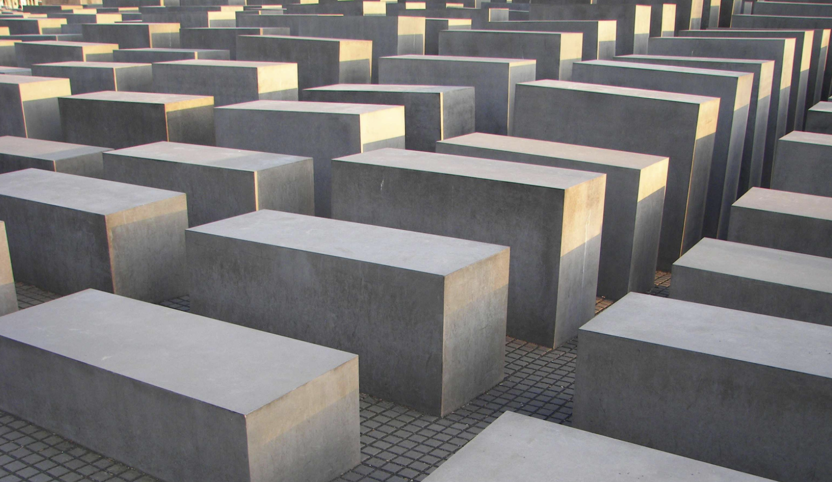
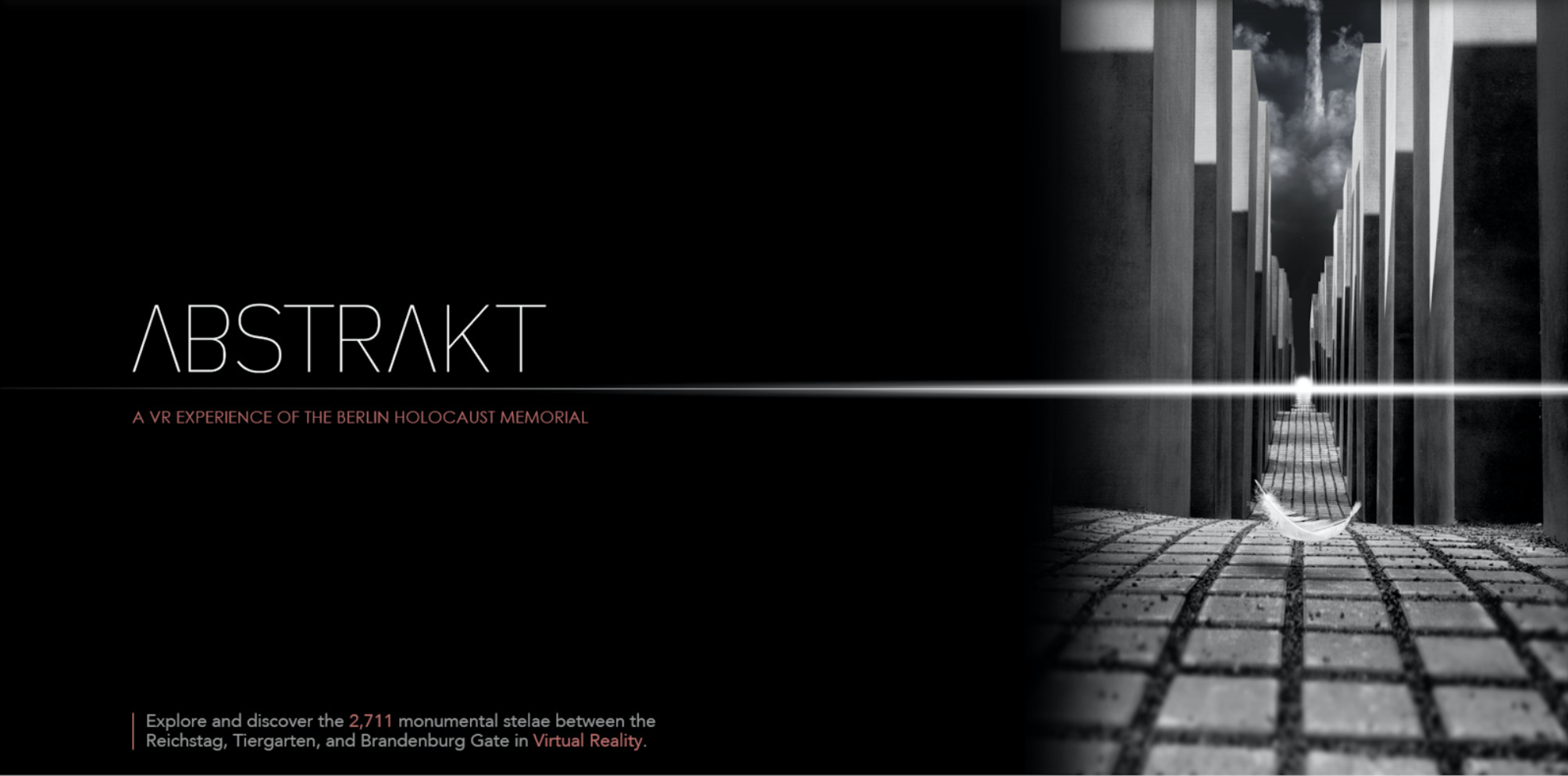
The architect Peter Eisenman designed a field of 2,711 concrete blocks covering an area of 19 000 sqm. The blocks are low at the edges of the site and grow taller (while the ground steep gets deeper).
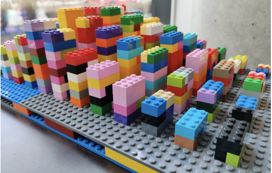
We decided to build a simple lego prototype to understand the feeling of getting deeper into the forest of high concrete blocks, so we could understand how to transform it into a VR space.
I felt that simply building a 3D space of this prototype will not provide the same atmosphere, I wanted the ground to be present in the long vistas so it would be as closest to the source as possible.
I had found a gorgeous 3D model of the site, we had so little time to work on it I wanted to waste as little time as possible. I have made a contact with a talented architect Efim Armand that provided us with a 3D model of the memorial he had made as a personal case study, and gave us a green light to use it in our prototype.
VR EXPERT INTERVIEW
We had an in-depth discussion with CDM (Centre for Digital Media) alumni Yangos Hadjiyannis, who is an expert on VR projects. He gave us a lot of industry insight and two main points.

USER JOURNEY MAP
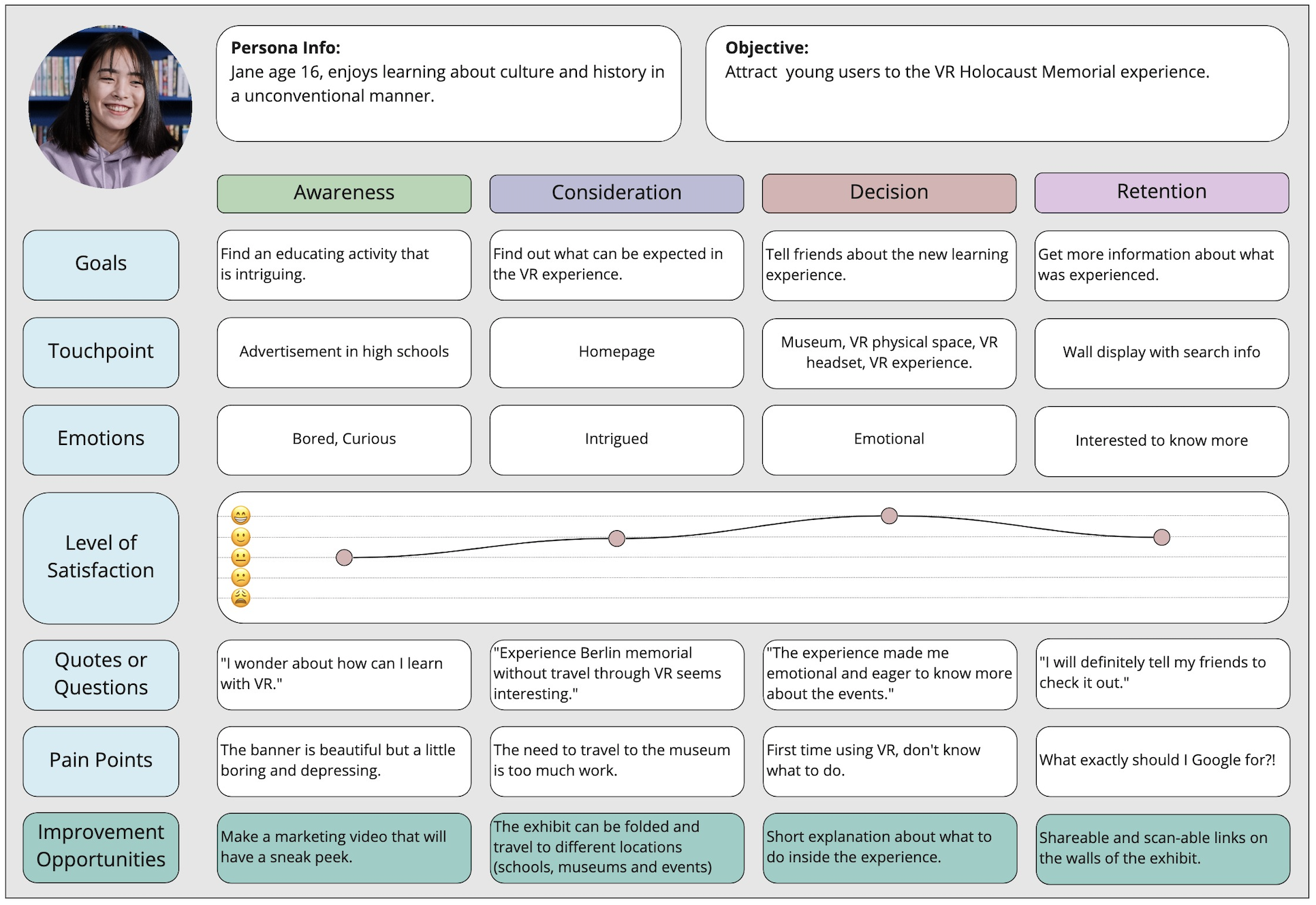
The goal of the user journey map was to understand better how our targeted audience might think and act. In addition to better understanding our users, user journey map gives an opportunity to see what are the pain points and address those.
TURNING POINT
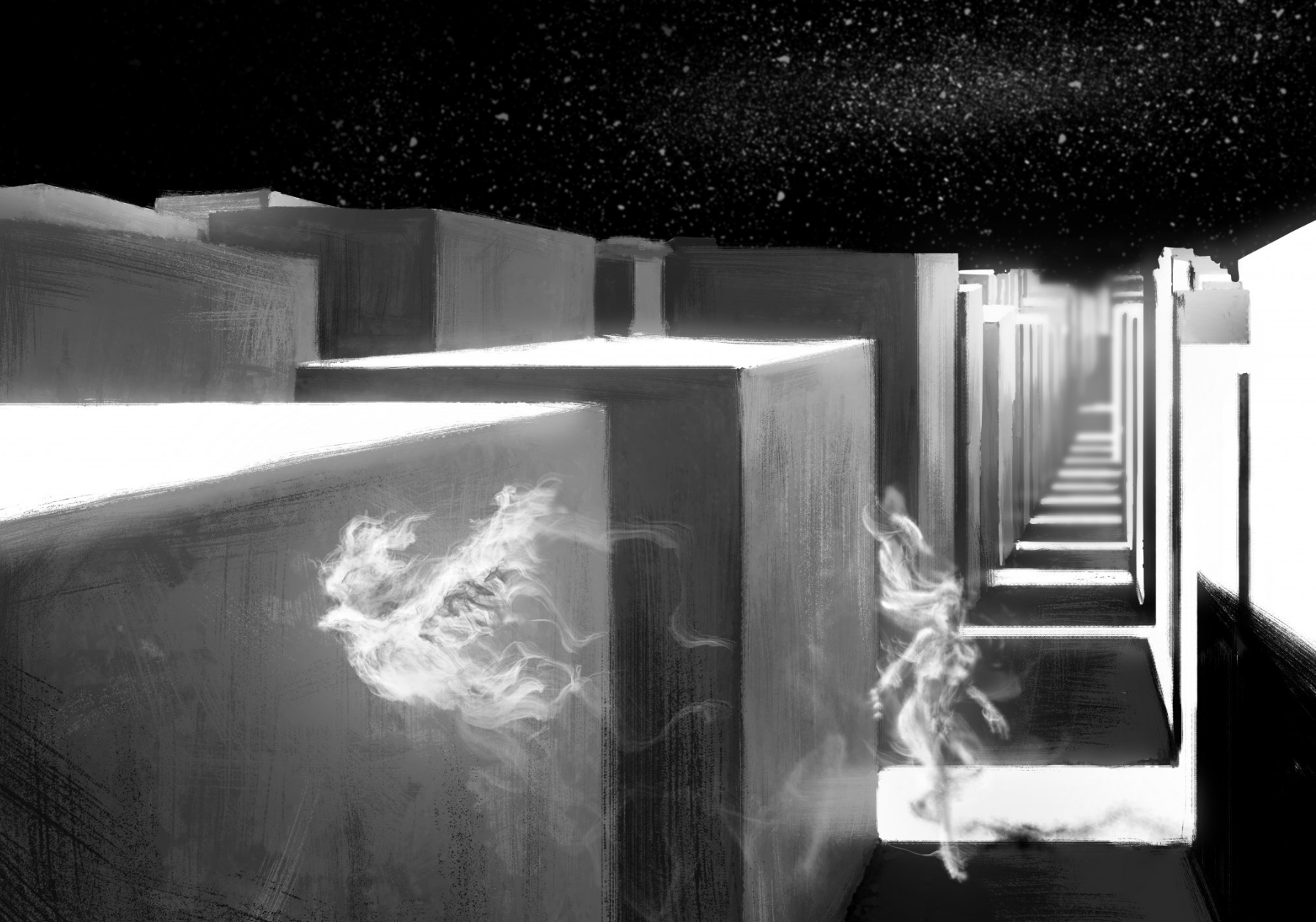
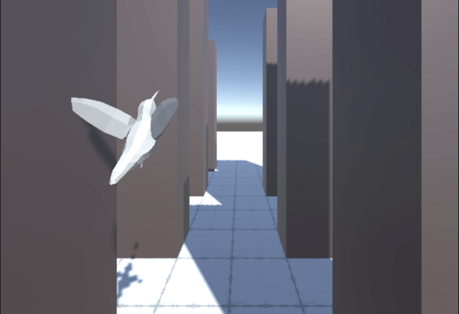
The concept artist on our team Jian Shi was working all this time on the different 2D aspects of our project, he made a key concept art that moved us away from the story based project into an abstracted version where the user will be active. The concept art shows a dove as a navigator for the user through the experience.
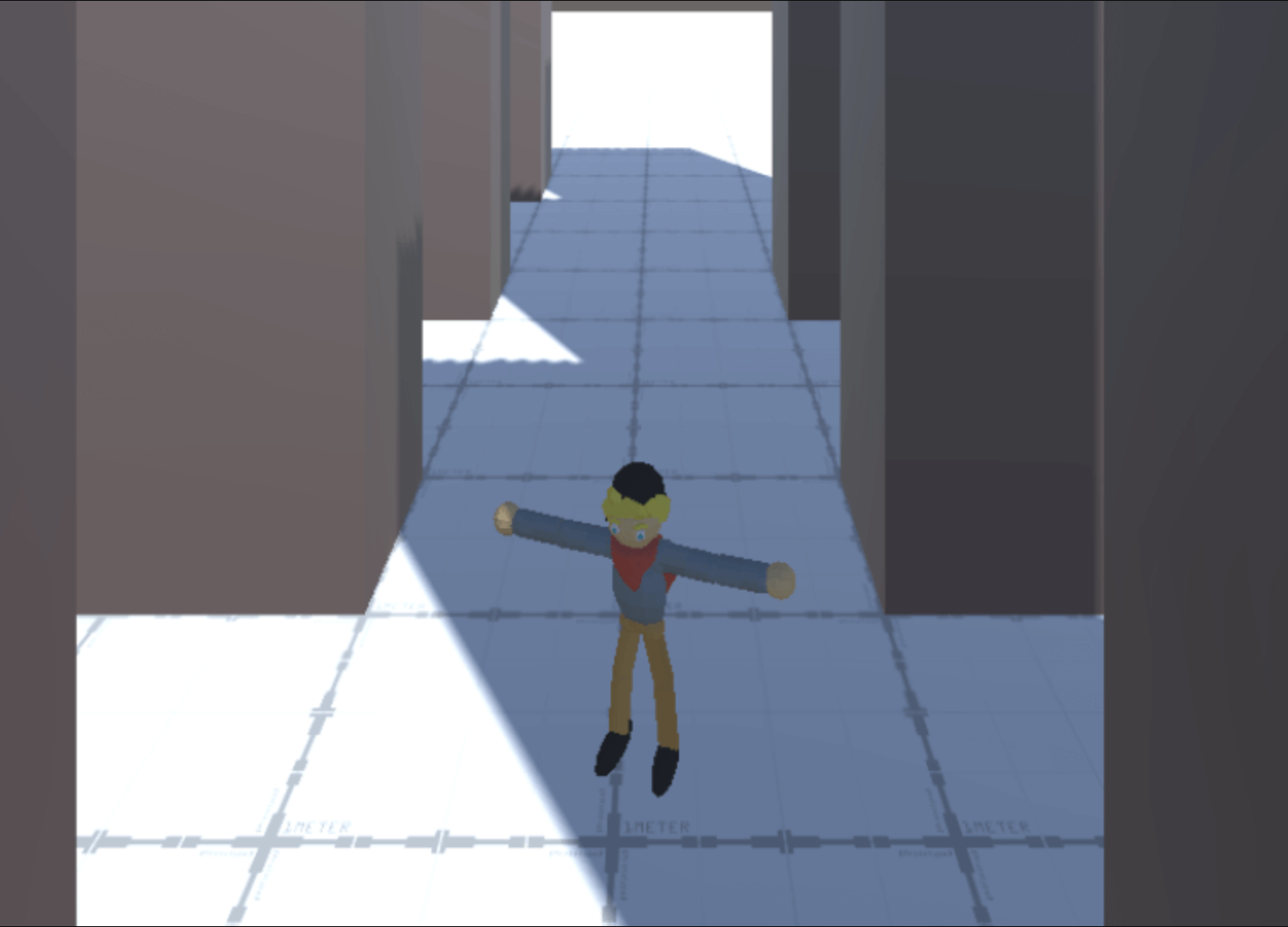
With this new concept in mind we started to prototype the VR experience, where the dove helps the users to find their way in the VR space and find objects (that further might connect us back to the story, where objects belonged to different people).
THE SPACES
The 3D model we got from the architect was amazing but too heavy for unity as it contained too many small details that collided with each other from a technical point. As I also wore a 3D designers’ hat I decided that we will use the terrain and the concrete blocks from the original model and retexture it for unity.
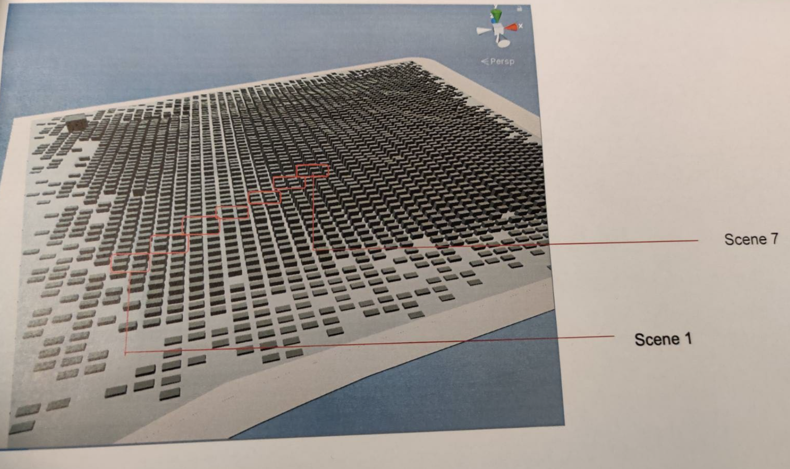
The conversation with the VR expert led us into the understanding that our physical space is very limited while the virtual space is huge. With the help of our programmers on the team we needed to nail down the navigation. The user will walk 4×4 meters in real world while visiting the vast memorial in the virtual space. From the last user test with the low fidelity VR prototype, I’ve noticed that while users touch an object they don’t notice the surroundings for a few seconds. This attention gap was our opportunity to jump them into different scenes in the memorial. There will be 7 scenes, changing in atmosphere with every jump. Users will have an understanding and a feeling that they are walking through the memorial without actually doing so.
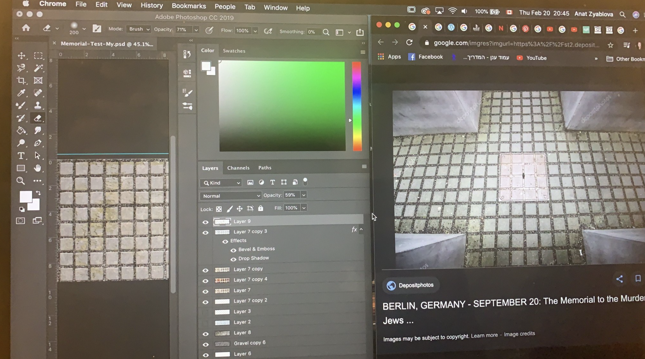
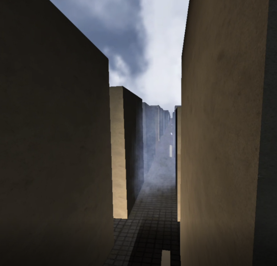
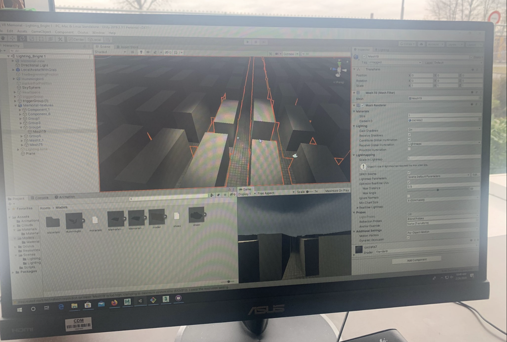
I was the 3D designer on the team, so I worked on the VR environment, doing the texturing and lighting in unity. I also brainstormed with my teammates and came to the conclusion that we needed to create a boundary in the VR space that will be the actual boundary of the physical space. I thought that using a fog will add to the atmosphere and play well as a visual boundary.
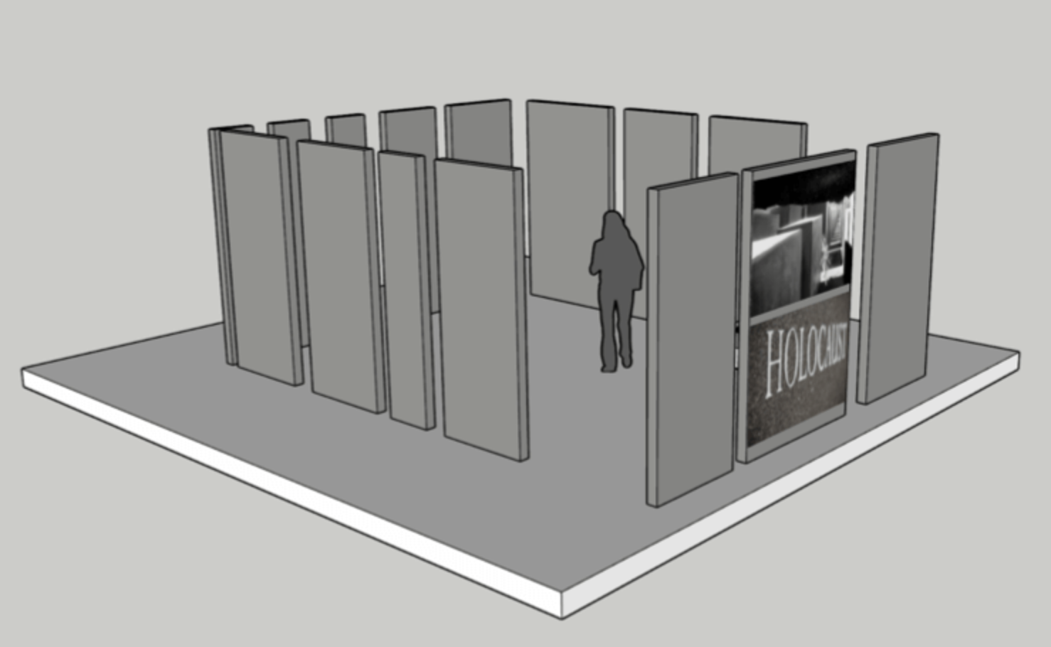
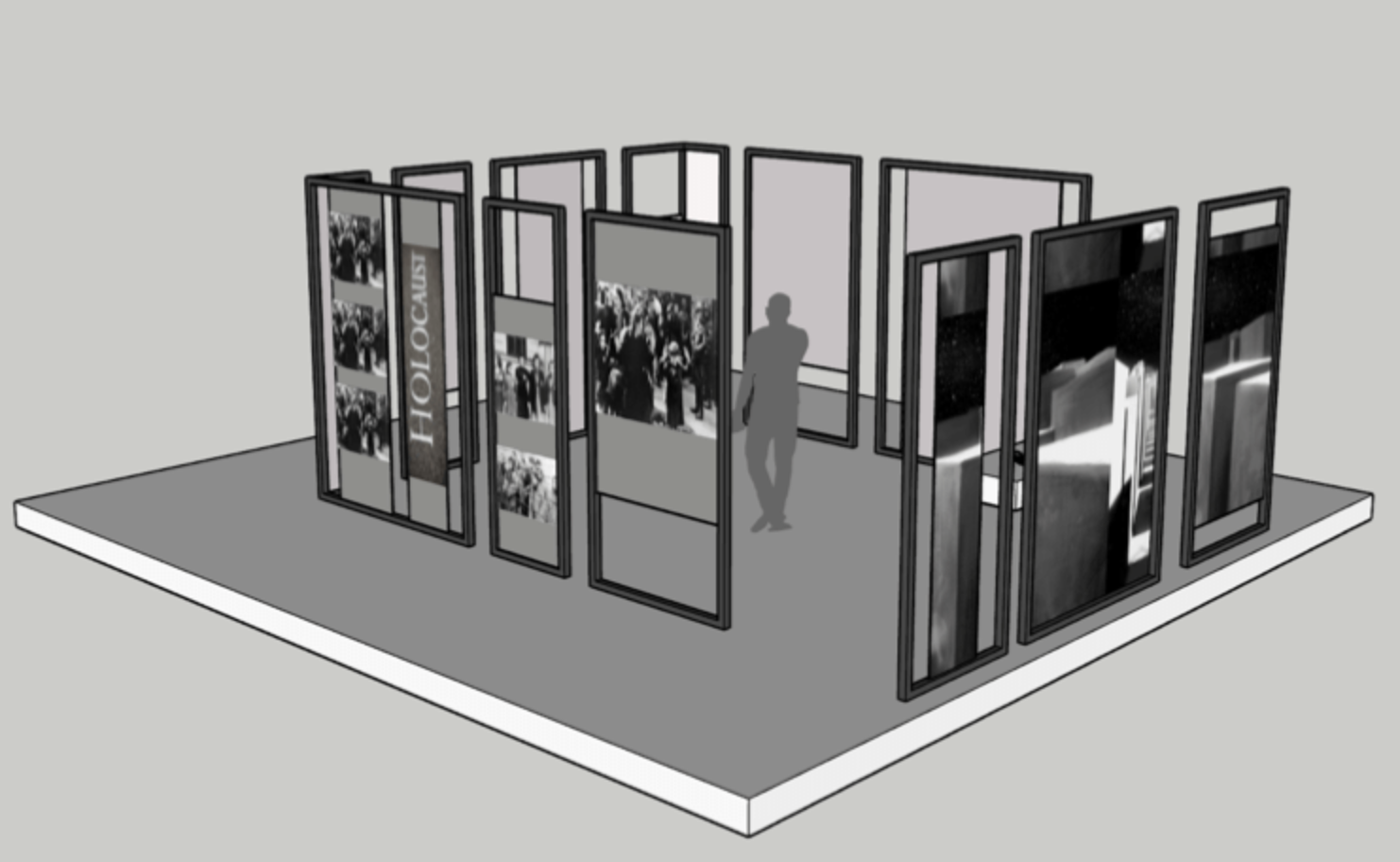
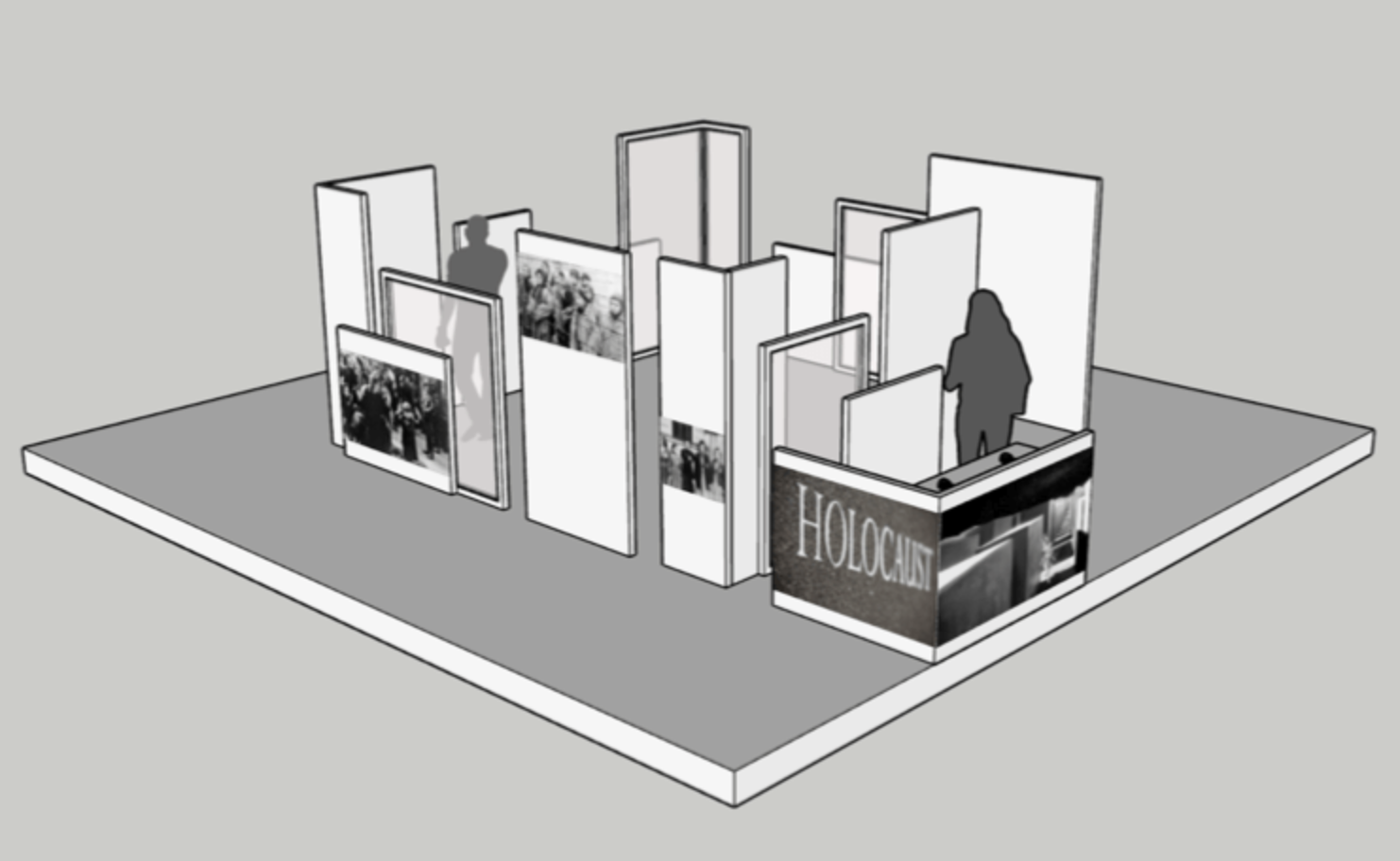
The physical space was also very important, that is why with my architectural background it was very easy to present the client a few alternatives to choose from. The design was inspired by fast exhibit installations and the memorial itself.
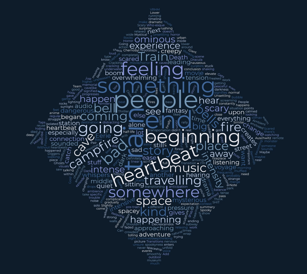
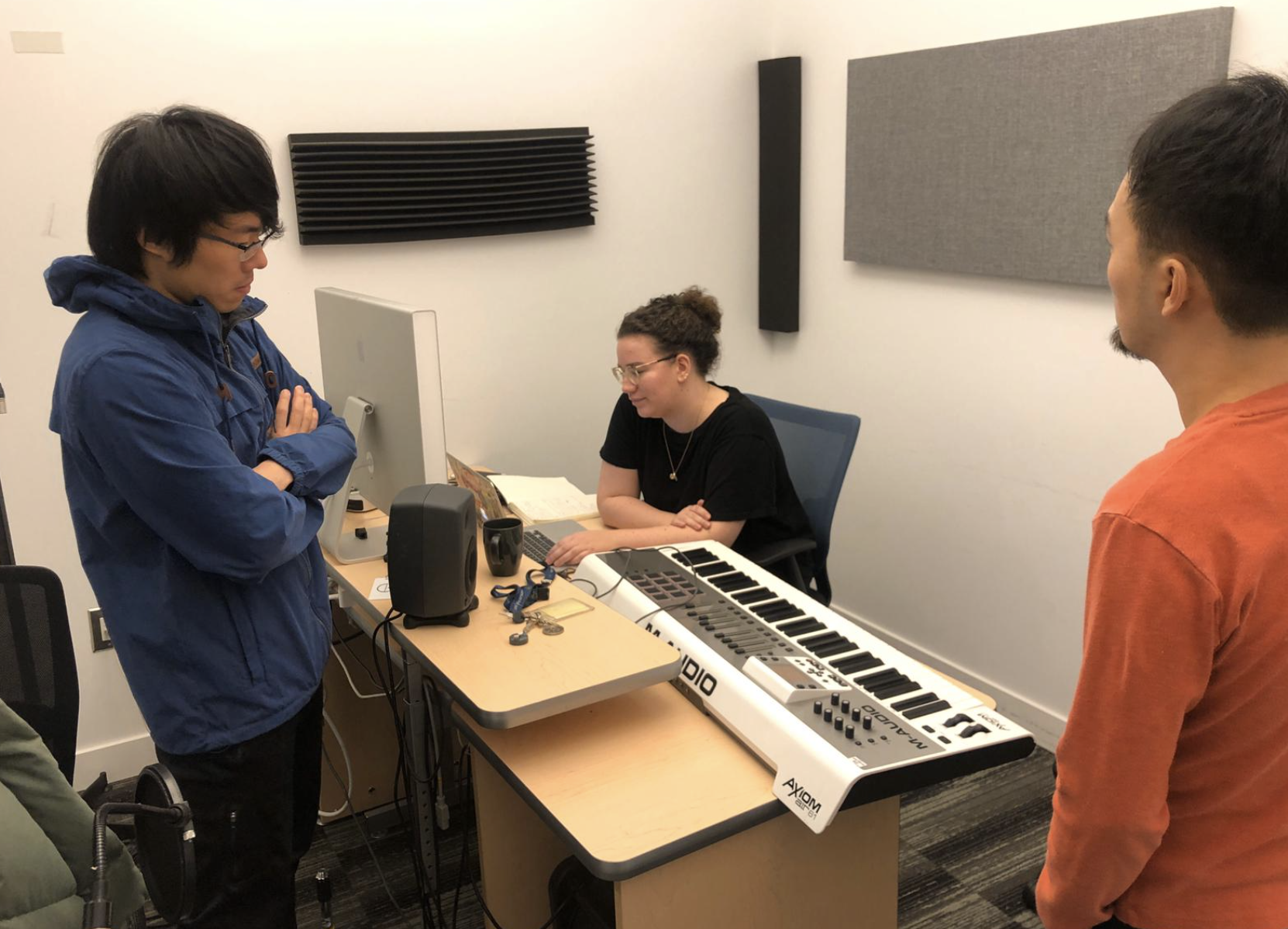
Our designer on the team, Isabel Hughes, worked on the graphic design, marketing and the sound design that is a huge part of the whole experience.
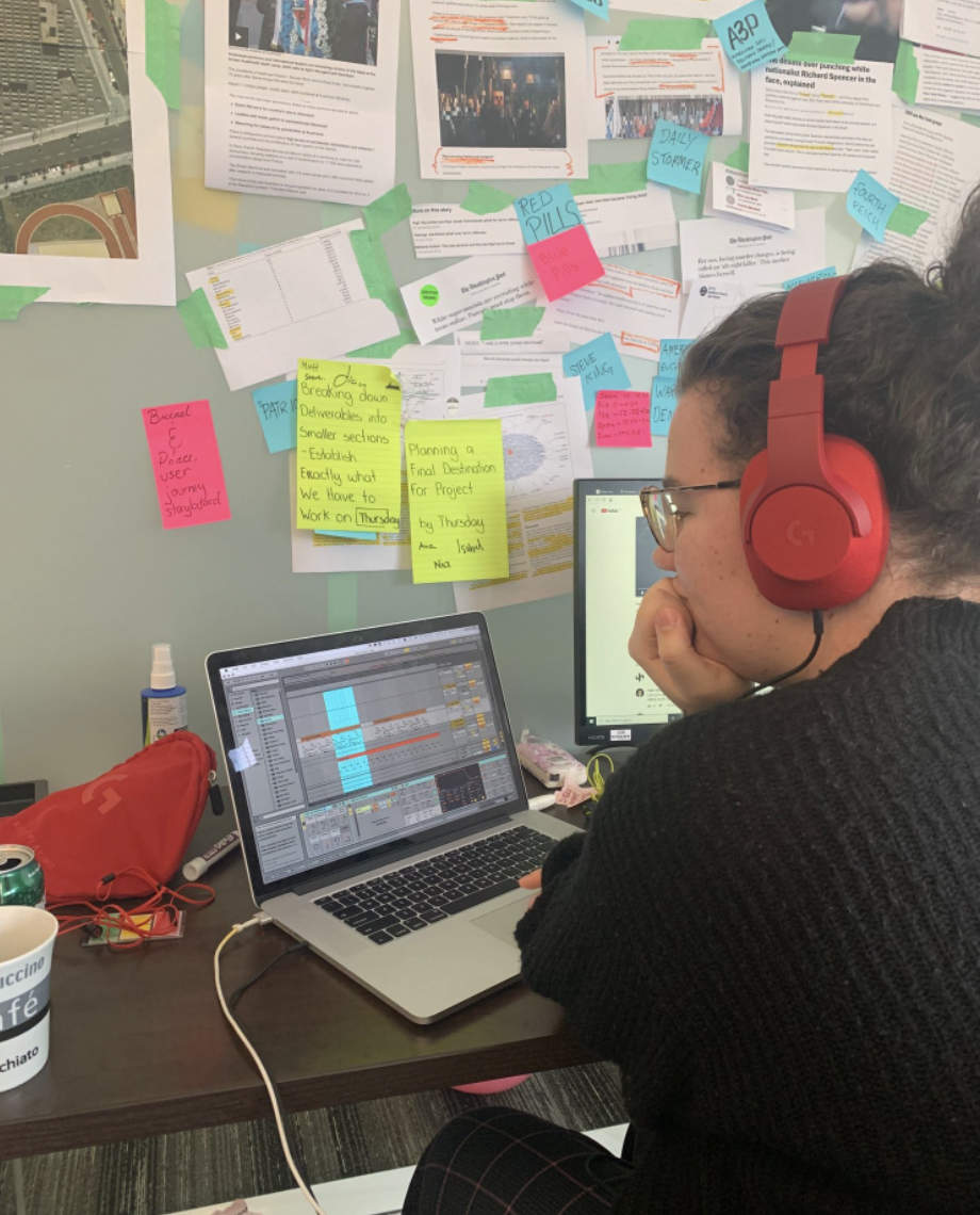
USER TESTS AND ITERATIONS
We did user tests every time we tried to add a new feature or to adjust the desired atmosphere. Our users were very helpful and we were able to identify three main pain points.
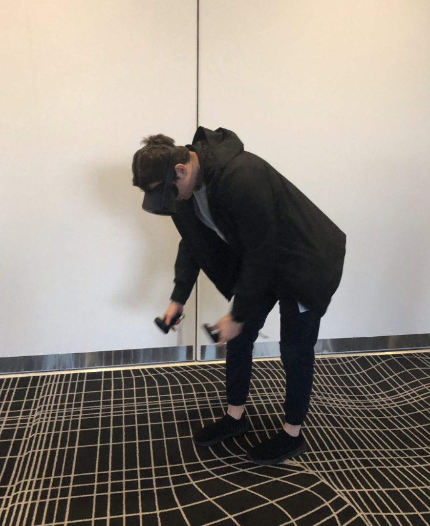
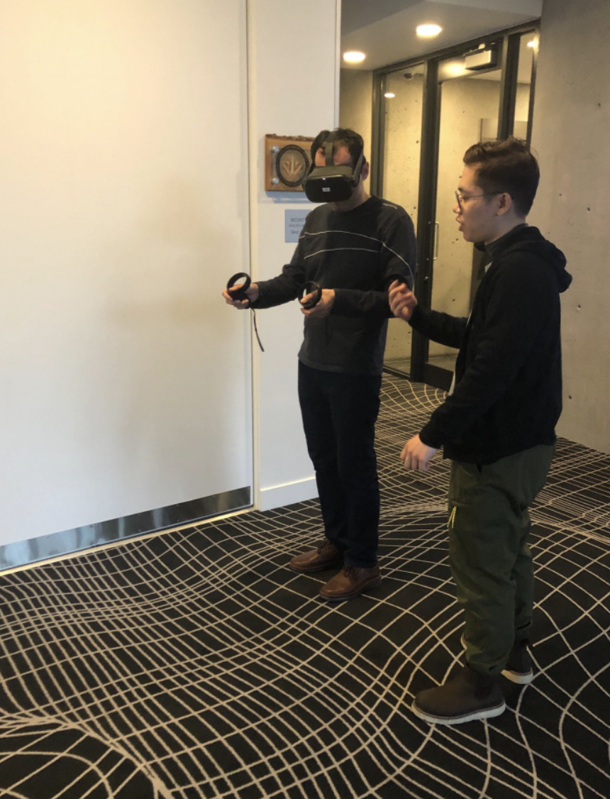
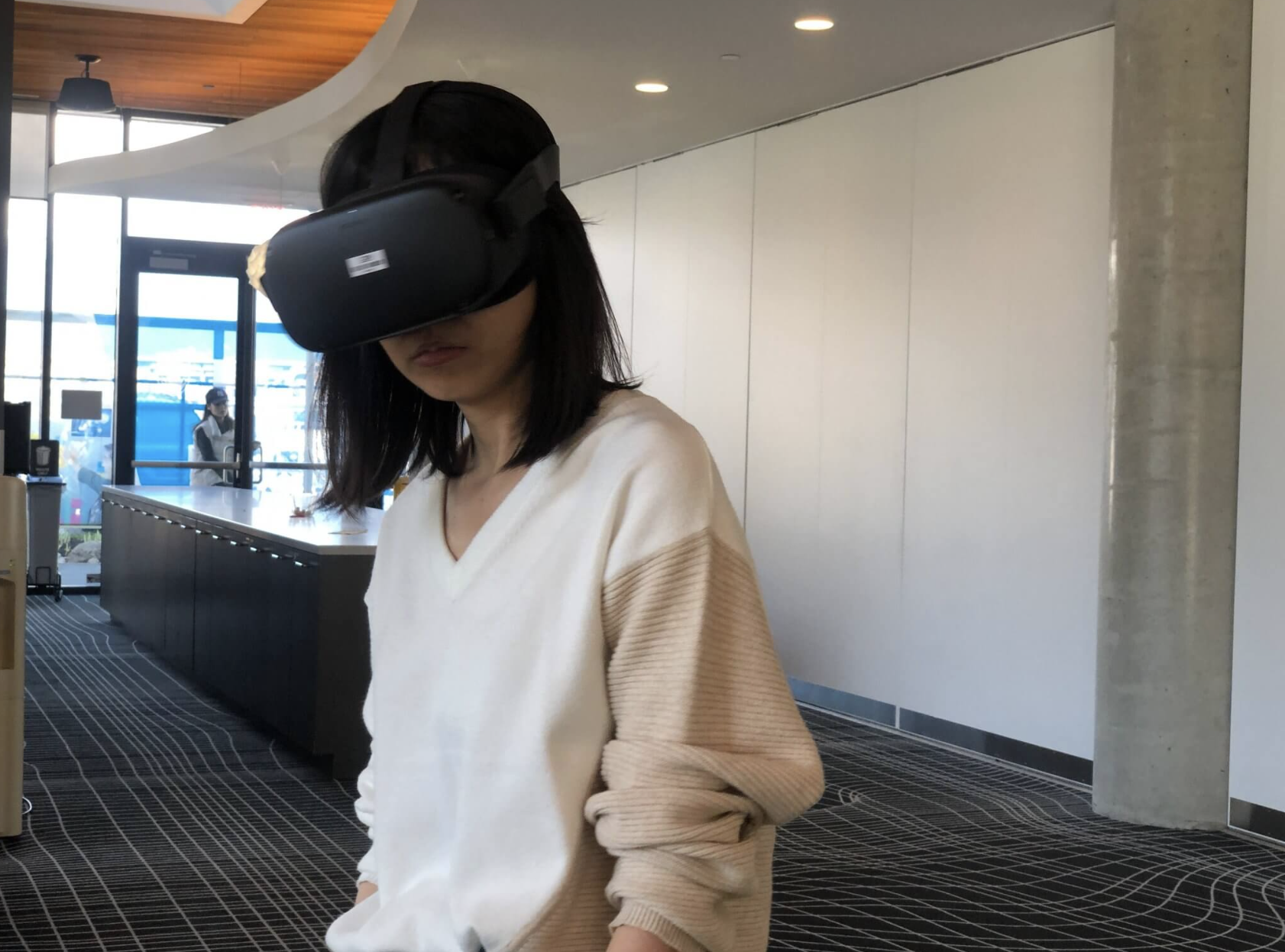
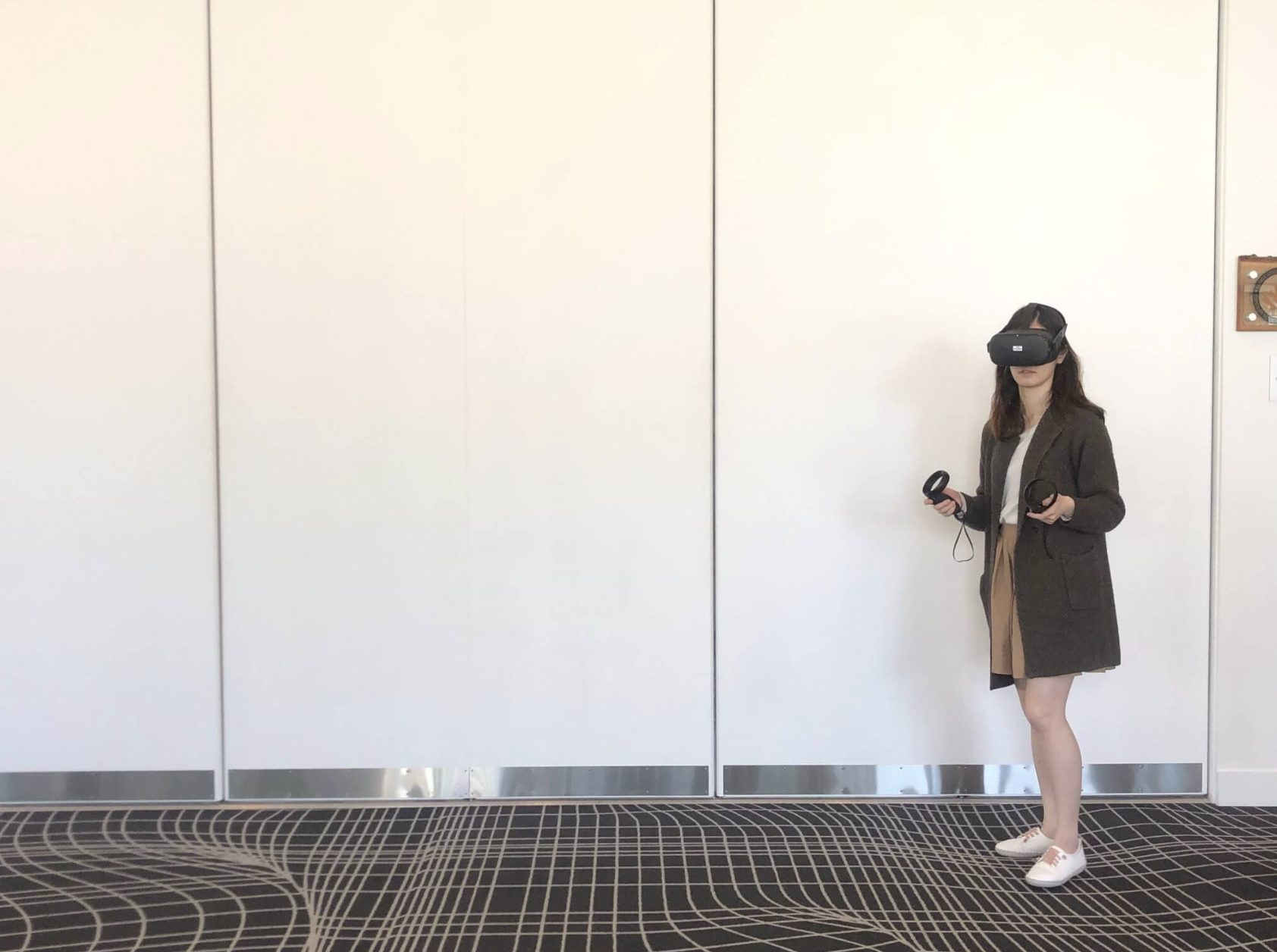
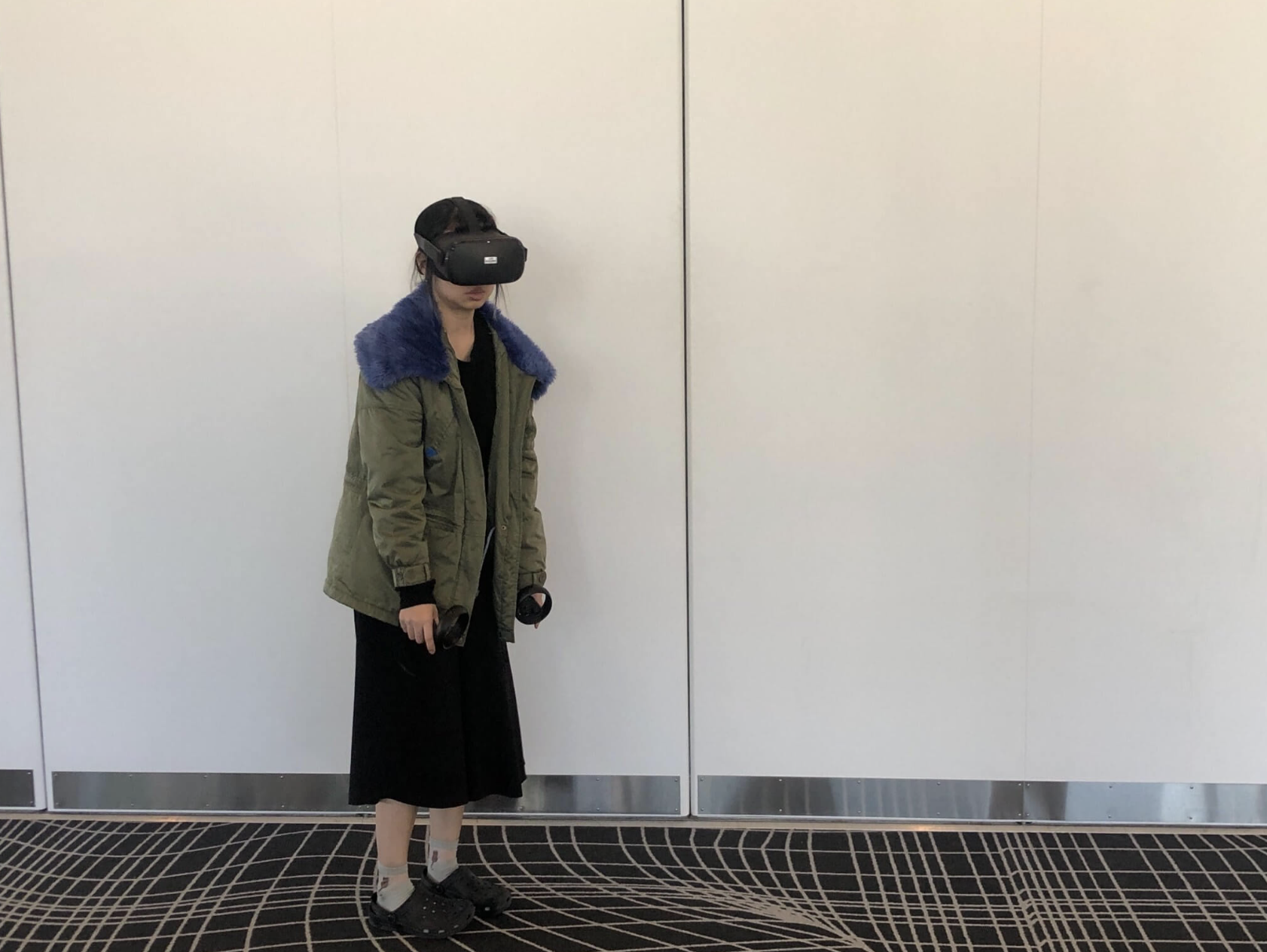
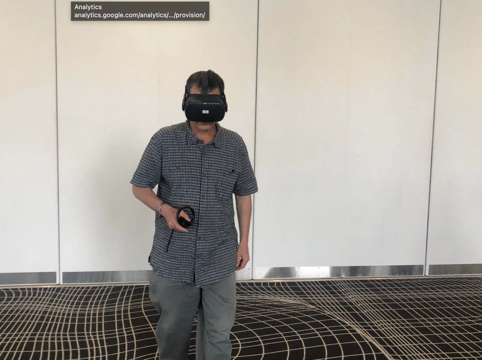

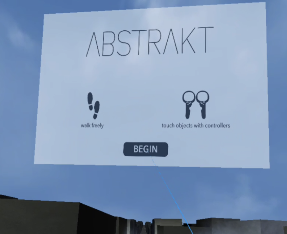
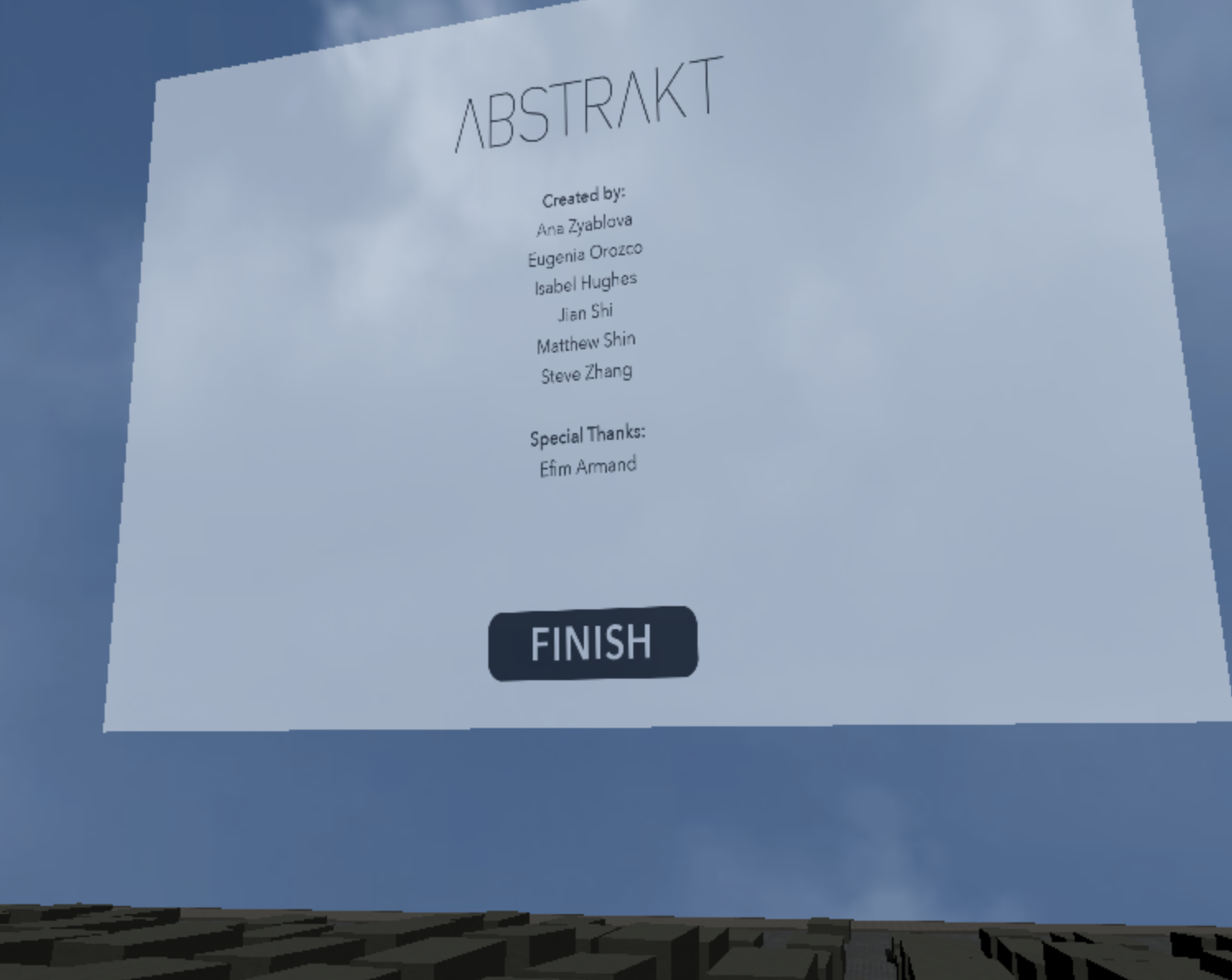
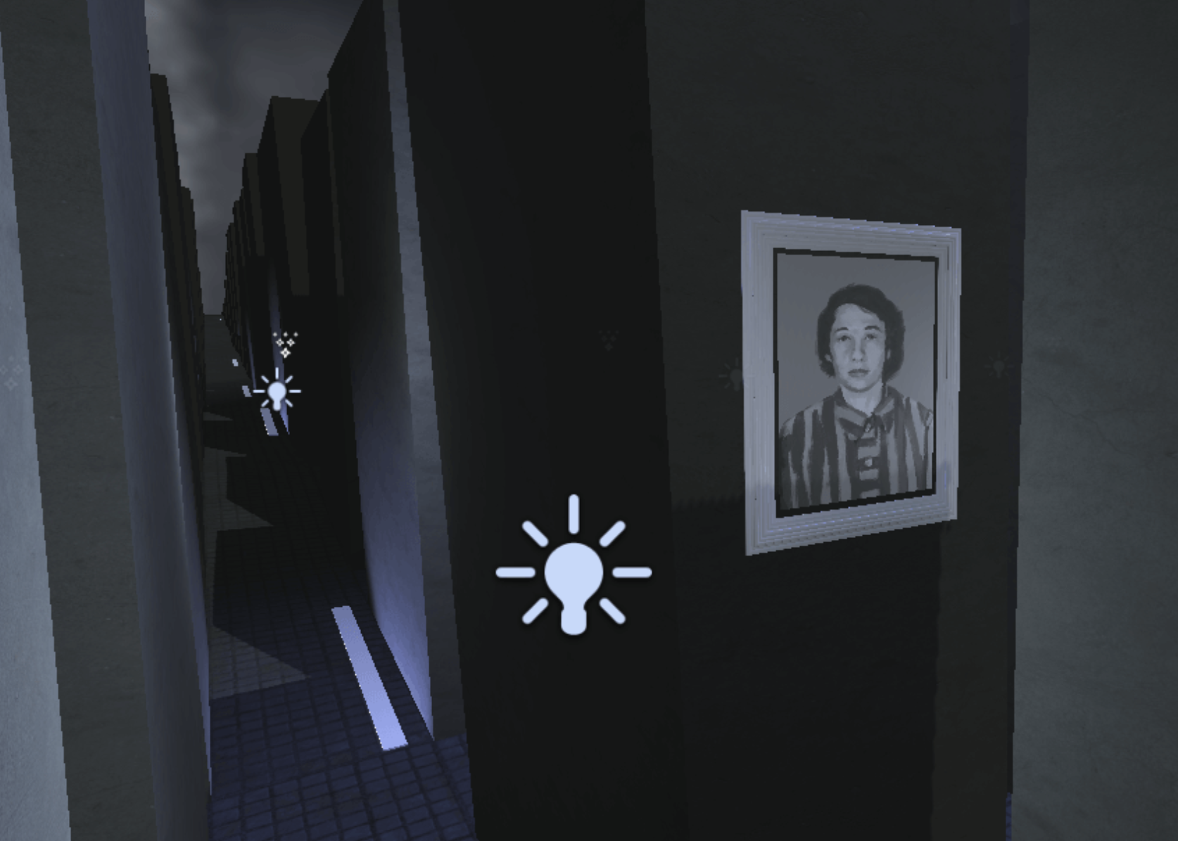
We addressed those by adding a beginning screen which worked as an onboarding feature. When the experience ended we added an ending screen with credits, to ensure the audience understood and felt comfortable. The main change was the objects inside the virtual space, we decided to use portraits of actual people. We found an amazing project by Brazilian artist Marina Amaral, that has coloured 20 photos for the “Faces of Auschwitz.” Inspired by her work Jian Shi (our 2D artist) made portraits of Jewish prisoners that will appear after some time on the walls of the concrete blocks. This personalized the experience, users felt more emotional once saw that it is all about the people and their memory.
THE VERTICAL SLICE
The experience got very positive reviews from users and our client.
The final deliverables included:
- GitHub repository – includes all the code for unity
- 3D assets – The memorial and all the features within it
- An art journal – every artistic iteration and idea
- Project documentation
- Marketing posters and banners
CHALLENGES
Sensitive matter
One of the very difficult things we encountered was to treat this sensitive subject very cautiously when exploring new tech ideas and present those to users. The Holocaust is a very difficult subject to research and explore, we defiantly felt it was taking a toll at times on our emotional state. That is why we tried to stay positive and did a lot of bonding activities to clear our heads.
New Tools
Working in a 3D environment wasn’t a new thing for me but Unity was a big challenge, as it is quite different then a usual 3D visualisation programs I was used to. The exciting part was to make some visual effects like lightening bolts and disappearance of the portraits.
Another deep dive was working closely with programmers on the Github repository, how to work on my branch and merge to master and even some coding. I’ve learned a lot, but most important lesson was that I can adjust and learn anything new if it is necessary for the project.
KEY TAKEAWAYS
During this project we did a vast amount of user tests, and it strengthen the fact that it is one of the most important parts of any product. It shade light on many important pain points. The personas and user journey maps helped us to stay focused on the people that will use the product and not only on the idea.
This is an Industry project that is a part of the MDM educational program.
Astor, M. (2018, April 12). Holocaust Is Fading From Memory, Survey Finds. Retrieved from https://www.nytimes.com/2018/04/12/us/holocaust-education.html